White Balance Chart Super-Test
One of the most important things for getting the best out of your camera’s sensor is to white balance it before shooting (or after in the case of RAW image data). This ensures that each of the Red, Green and Blue channels (RGB) gets equal weighting, giving you a balanced image with maximum dynamic range in each channel.
In order to get a proper white balance value for your camera, you need some form of chart which provides a neutral reflection of the light in each RGB channel. This is a lot harder than you would think, as the material selected for the chart must reflect the whole spectrum of light without adding its own temperature or tint, which would skew the results.
I sometimes get people complaining that Leeming LUT Pro™ causes their images to colour shift away from neutral. What I invariably find is that they are using a white balance chart or device which is not neutral, meaning that when they use it to “neutralise” their camera, they are actually introducing an error into their footage and skewing the results, which the LUTs then faithfully reproduce.
To prevent this, I decided to conduct a test of most of the common white balance charts and devices out there, to see which were neutral as claimed by the manufacturer, and which were introducing errors. All charts were bought privately to avoid any manufacturer cherry picking their best samples.
The primary chart I use for building LUTs is the very expensive, but individually measured and calibrated, DSCLabs CamAlign ChromaDuMonde 28. This chart is absolute overkill for white balancing your images, but because it has been measured at the factory (they provide a great little booklet with each chart that gives you the measured values of each colour and greyscale swatch), it provides a KNOWN GOOD REFERENCE by which I can judge the other charts.
Test Methodology
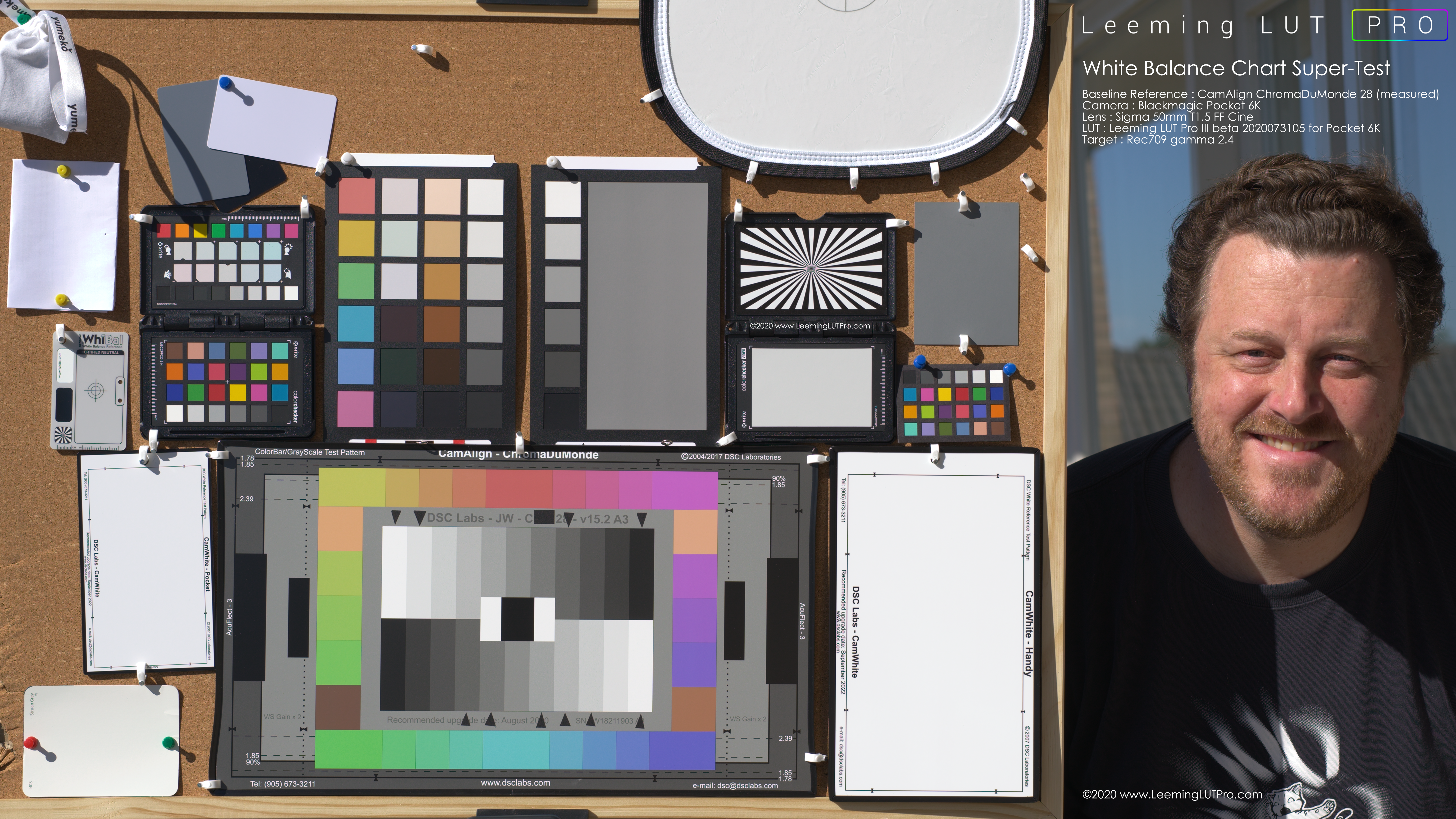
To accurately judge the various white balance charts and devices against the reference, I decided that the only way was to shoot them all at the exact same time, in order to remove the temporal variable which might introduce shifts in the lighting or exposure.
I used the Blackmagic Pocket 6K camera in BRAW Q0 mode at ISO 400, so that I could adjust the white balance in post to get it 100% precise. I used the Sigma 50mm T1.5 FF Cine prime lens stopped down to f5.6 to provide the sharpest image without any chromatic aberrations and a flat field exposure with no falloff. The 6K sensor is a touch smaller than Super35 size, further meaning that the central and sharpest portion of the lens is being used. Shutter angle was adjusted to keep the exposure exposed to the right (ETTR) to maximise dynamic range. I used the sun as the only light source to ensure the highest possible light quality with full spectrum coverage.
To measure the ExpoDisc 2.0, which is a type of lens cap with a semi-transparent fresnel to allow light to pass through, I attached the ExpoDisc and used the camera’s custom white balance function to get a temp and tint value while pointed at the Sun, before removing the ExpoDisc and shooting the scene again. This was done within seconds of shooting the test scene so temporal anomalies were minimised as much as possible.
I also used the Sekonic C-800 Spectrophotometer to get a Kelvin temperature readout directly at the charts, for later comparison in post.
To ensure the most accurate colorimetry and neutrality I used the latest beta of my Pocket 6K Pro II LUT. You can validate the LUT accuracy yourself using your software’s vectorscope, by looking at how it reproduces the colour and luma swatches of the ChromaDuMonde 28 reference chart. The LUT has a measured Delta-E(2000) of 0.68, which is under the threshold of human visual acuity for colour and luma (defined as < 1).
I measured each chart in Davinci Resolve 16 using the White Balance picker tool in the Color tab, clicking in different spots of each chart to get several results to average, with a reset to zero each time in between. I then reversed the numbers to show the deviation of the chart itself instead of the correction Resolve was applying to get to zero, and tabulated the results.
The Candidates
I used each of the following to assess neutrality in both temperature and tint. For a detailed review of each, scroll down for the overall analysis and results.
- DSCLabs CamAlign ChromaDuMonde 28 (baseline reference)
- DSCLabs Splash (Handy size)
- DSCLabs Camette (Pocket size)
- X-Rite Colorchecker Passport Video
- X-Rite Colorchecker Passport Photo
- DataColor SpyderCheckr
- WhiBal G7 (Pocket size)
- Lastolite EZY-Balance (30cm)
- ExpoDisc 2.0 (82mm)
- Munsell Colorchecker Classic 24 Nano
- Gin-Ichi Silk Grey V2 card
- Amazon / JJC 3-Pack White Balance Cards
- Taubmans Struan Grey Paint Swatch Sample Card
- Sekonic C-800 Spectrophotometer
- Generic White Printer Paper 80GSM
- White Cotton Bag (to represent clothing)
Results
Note that all charts and devices are being judged solely on their WHITE BALANCE ACCURACY. This is NOT a test of colour accuracy, which I will probably do separately at a later date.
There were some surprises, as is always the case with these sorts of tests. Below is the TL;DR version, summarised in a single table, ordered by lowest to highest deviation from neutral tint (as tint variation is more objectionable to the human eye than temperature). For a detailed review of each candidate, scroll down below the table. Temperature is measured in degrees Kelvin where a minus result is cooler and a positive result is warmer. A minus tint is more green whereas a positive tint is more pink.
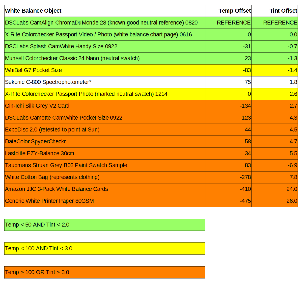
Aside from the ChromaDuMonde 28 reference chart which is a known accurate chart as measured by the factory, with its commensurate price, the overall winners were the X-Rite Colorchecker Passport Video / Photo (white balance side) and the DSCLabs Splash (CamWhite side).
I was disappointed in the DSCLabs Camette because it is priced similarly to the X-Rite and provides a decent vectorscope representation on the other side, but even after I double checked it, it fell outside of the parameters I consider usable for neutral white balance. Hopefully DSCLabs can improve the accuracy of that chart, as it is conceptually a good idea. Their Splash had no such issues though and gets my high recommendation, at least for white balance (it’s also waterproof to boot). You can also get the DSCLabs CamWhite and X-Rite White Balance cards independently of their colorchecker versions for less money, so although I didn’t specifically test those, they are potentially good options.
Detailed Reviews
DSCLabs CamAlign ChromaDuMonde 28 (link to manufacturer)
This is my reference chart for good reason. It’s eye-wateringly expensive, but as with everything in life, you get what you pay for. It is individually printed and measured at the factory to ensure that it meets the tight tolerances necessary for accurately matching Rec709 gamma 2.4 for cameras. DSCLabs provide a booklet with each serial numbered chart which gives you all the measured test results for each of the 28 colour swatches and 22 greyscale swatches, so you KNOW precisely where it should fall on both vectorscope and waveform.
On my own chart I added little black triangles to show me which of the greyscale swatches are dead neutral. I normally use the bottom white swatch as my reference picker as I’ve confirmed its accuracy many times in practice as well as knowing it’s accurate from the measurements provided.
I don’t carry this chart around with me as it’s too bulky, plus I want to protect it as much as possible to prevent degradation. This is strictly my reference for building my corrective camera LUTs, as those need the absolute highest precision for ultimate accuracy in both colour and luma.
Needless to say, being a measured reference, the neutral swatches are indeed 100% neutral, with zero temp or tint shift, so it forms the baseline which all the others are measured against. Buy this if you want to KNOW FOR SURE that your chart is accurate, because that's what you are effectively paying for.
DSCLabs Splash (link to manufacturer)
This is a specially produced chart designed for underwater usage, or in adverse conditions. It is fully waterproof and has a glossy finish. As a white balance chart, it scored extremely well, within what I would consider the error rate of the white balance picker in Resolve. It’s a fairly large chart to carry around but fits within a camera bag. It’s price is higher than the X-Rite Colorchecker Passports though so for most situations I would recommend those instead, at least for white balance considerations.
DSCLabs Camette (link to manufacturer)
Even though this chart comes from the same company that builds the reference ChromaDuMonde chart, I found this particular sample to be disappointing. It’s a shame, as it is a good size and is roughly the same price as the X-Rites, with a decent, though not perfect, six swatch vectorscope primaries chart on the other side. I wanted to love this chart and double checked my results, but they remained the same. Too much temp and tint variation make this a no-go for white balance purposes.
X-Rite Colorchecker Passport Video (link to manufacturer)
This little chart aced the test for white balance, scoring identical to the reference with zero temp and tint variation from neutral. Its construction is good in that the clamshell protects the chart surfaces when closed, but you can open it up in such a way as to have it stand by itself, or allow someone to hold it easily without touching the surface of the charts. While the colour swatch side isn’t up to the same standard for vectorscope work, it gets a highly recommended for the white side at least. If you are tight for cash, you can probably buy the X-Rite white balance only chart and I’d expect good results from it.
X-Rite Colorchecker Passport Photo (link to manufacturer)
The Video and Photo versions of these charts have the same white card side (I tested them separately to confirm before the super-test), so if the white balance is your only consideration, buy either one with confidence. For the super-test I therefore decided to measure the small neutral swatch used by photographers to set cooler or warmer tints (it’s the one marked with a half circle) to see how neutral it was. In terms of temperature it was indeed perfectly neutral, but it did have a tint to it outside of my tolerance range, so I marked it down on that basis, but for pure white balance considerations, it is equal to the Video version. Highly recommended as well.
Munsell Colorchecker Classic 24 Nano
This is a diminutive little colour chart, perfect for shooting tiny objects! As such it’s not really useful as a pure white balance card for your camera’s auto functions, but if you are shooting raw data, then I can say that its light grey swatches are indeed quite neutral. A specialised chart for sure, but if you need it, it’s accurate enough with those caveats.
Sekonic C-800 Spectrophotometer (link to manufacturer)
I used this more as an external reference to see how closely the measured colour temperature of the sunlight measured up to the camera’s internal white balance and also the manually adjusted white balance in Resolve. The C-800 does not provide any tint measurement per se, so I only used the Kelvin measurement and used the camera’s tint to calculate the difference. This is not a device you would use to white balance your camera, as it cannot know what your camera’s reference white is (they vary in numbers, if not in actual objective measurement). It is only a comparison between the two auto white balance values between it and the camera.
WhiBal G7 (link to manufacturer)
Certified neutral is the claim, but unfortunately it didn’t hold up in practice. It’s not as bad as some in this test, but it fell outside my tolerances for neutrality in both temp and tint. I bought the pocket size as I was only planning to use it for the test, but if you were to buy this I’d say go for the bigger sizes to provide your camera with enough area to do its auto white balance function. The positive aspect of these charts is that they are reasonably priced, so you're not out too much if you already bought one!
DataColor SpyderCheckr (link to manufacturer)
A disappointing result as it’s a fairly common chart and I like the design of the clamshell case and the fact you can reverse the inserts easily. But the tint of the greyscale target in particular was outside tolerances, meaning it failed in its purpose as a white balance target.
Lastolite EZY-Balance (link to manufacturer)
An inexpensive, foldable target, it looks handy at first glance for use with longer lensed shots, as it’s quite large in comparison with the others. However its tint was out of tolerance by a fair bit, plus the silkscreened white looks prone to deterioration with fold creases already in it from the very first opening.
ExpoDisc 2.0 (link to manufacturer)
This is very different in that it measures the ambient light of the scene via your camera’s auto white balance function. The problem with that concept is that it is necessarily taking an average value, with colour reflections in the environment potentially affecting the result. Pointed at the Sun, it gave a slightly different temp and mdeium different tint than the reference chart, meaning that it is likely negatively influenced by the surroundings and objects, or by the plastic fresnel itself. Coupled with the inability to have the neutral target in the frame with your subjects (since you need to shoot it separately), this cannot be recommended.
Amazon / JJC 3-Pack Grey Cards
These are, quite frankly, shockingly bad. Whoever signed off on these for sale should be taken out the back and quietly disposed of. If you have these, burn them, just to prevent anyone else ever using them for their mis-stated purpose. If someone ever recommends these to you, point and laugh at them, for they are truly beyond redemption. Avoid!
Taubmans Struan Grey Paint Swatch Sample
I originally picked up some of these cards as they looked quite neutral to my eyes when placed next to my Colorchecker Passport, but the test proved they are not good enough. At some point I will probably do a big test of those free paint swatches to see if there are any which can be recommended if you’re looking for cheap/good, but today is not that day. Not too bad in the temp department but tint is way too much in this case.
Gin-Ichi Silk Grey V2
I picked this up in Japan as it was cheap and came recommended. Whilst it is pretty close to its advertised 18% grey level for luma, it is unfortunately not colour neutral and therefore not a good candidate for white balance usage. Whilst the tint is not crazy bad, the temp is way outside neutral, so I have to say no. Use these types of 18% grey cards for their intended purpose – setting middle grey on the luma waveform. And in the case of my LUTs and shooting ETTR, these are of no use anyway, as middle grey isn’t relevant.
Generic White Printer Paper
Way too blue and way too tinted, this takes the dubious honour of being the WORST white balance target of the whole test, with off the charts numbers. Don’t be tempted by the price of free… you will wreck your shots and be the laughing stock of cinematographers everywhere. Do not use!
White Cotton Bag
How many of you shooting people have used their white clothing as your white balance target? Short answer – don’t! I used a white cotton bag with a silk ribbon tying it together as a two part fabric test, and both gave very bad results. Do not be tempted! Take five extra seconds and shoot a proper white balance target. Your subjects will thank you.
Conclusion
Proper white balance is key to giving you correct skin tones and keeping colours looking as they should. It is the first step in my recommendations for getting the best out of your cameras.
My corrective LUTs are designed for absolute accuracy, so giving them the correct starting point is critical if you want to ensure that they perform as advertised. Getting the proper white balance also ensures that each of your camera’s colour channels uses all the available dynamic range, meaning higher quality, more filmic images.
By using an accurate white balance chart, you eliminate one of the most important variables that can negatively affect your camera’s initial colour read, so whenever possible, be sure to set your camera’s custom white balance in your key light before shooting. Then Leeming LUT Pro™ will faithfully recreate the colorimetry and luma of the scene, meaning you always start with an accurate baseline as the camera saw it. Of course, your lighting also needs to be tint free, but that is a subject for another day…